|
Getting your Trinity Audio player ready...
|
Save yourself from these horrendous T shirt designing mistakes.
Everyone loves to wear an amazing t-shirt that makes people turn their heads when you enter a room. But people are not able to nail the look quite properly. This can occur for more than one reason. People often end up making unintentional t shirt designing mistakes that ultimately ruin a great t-shirt.
Even the simplest designs are not as simple to make as we think they are. So, in order to achieve greatness, you need to avoid making common mistakes.
We have compiled the most common T shirt designing mistakes people often commit when making their designs come to life. So, stick around to find out:
Placement of Print on Shirts
Print placement is oftentimes confused with location, but it is actually the specific measurement of the point where you have to print the design inside the location. You can come up with cute shirt designs that make people stop and stare but if you get the placement of the design wrong, you will be making heads turn for all the wrong reasons.
If your t shirt graphic design is in a standard location like full back or full front, you need to ensure that the design placement is also standard and that it works across various garment sizes and types. If you want an alternate placement, make sure to inform the printing platform you are using and ask them to show you how it will look.
Also Read: T-Shirt Printing Methods 2021
Composition
Composition is something you may recall from when you learned how to design a shirt or from your high school art lectures. Every design contains some elements arranged in relation to one another and this relation makes up their overall composition.
What makes for a carefully designed composition can be a matter of different opinions, but the rules are the same that can enhance your design significantly and take it to the next level. You can learn about it online if you want to boost your composition game.
A typical t shirt designing mistake people make when printing popular sweatshirt designs is that the elements are way too bunched up or too spaced out. Sometimes the whole design is off-balance which draws the eye to the wrong place or the typing is in the wrong order. So, there is a variety of elements in your design then you need to put effort and time into your composition and then show it to your fellows to get their feedback.
Number of Colours
Colour is extremely important not just for design purposes but also for screen printing. Make sure that it does not cross your budget because more colours mean more cost per item. In some cases, screen printing uses a technique known as halftones, which involves tiny dots that are able to make 3, 4 colours appear as if there are many more.
Also Read: How to Screen Print: A Step-by-Step Guide for Beginners
You need to think about colours from the very moment you start designing a shirt because they can have specific effects on different people. So, you need to be aware of colour psychology.
If you are using direct to garment printing instead of screen printing, then it is obvious that the printing will be done in full colour, so the number of colours do not matter here anymore, hence, budget isn’t a problem here. This makes this method a good choice for full-colour photographs but still the colour choices matter in terms of aesthetics.
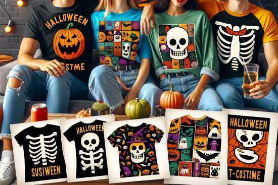
Adding a lot of colours to your t shirt such as fall shirt designs to make the design look vivid can backfire and make your shirt look ugly because of clashing. Go for an ideal number of colours to choose from based on what you need to correctly represent a picture or an official logo. So, you need to fulfil your design goals while using the least amount of colours.
Also Read: Things You Should Know Before You Buy Heat Transfer Paper
T Shirt Design Size
T-shirt printing is a business where size matters a lot. It is important to consider how big should a shirt design be instead of just going with the standard sizing most of the time. You need to decide the size on the basis of your design’s nature and the characteristics of the garment you are printing on.
The size and shape of the design are what makes a good t shirt design, and it can end up looking a lot bigger than it is supposed to. For instance, square or circles look better in smaller sizes rather than the standard size. You can also think about one size fitting all, so based on your garment’s size range and your order’s size you may want to think about going for a sized down print for smaller garments like for the youth and ladies.
Another factor to keep in mind is the style of the items you want to print which can have a limited print space sometimes, such as hoodies with pockets. In conclusion, size is important, and it can make or destroy your design so think about it before following through with the final design.
Also Read: How to Style a Hoodie in 5 Amazing Ways
Typography and Fonts
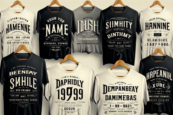
Typography is also known as the visual component of the words written on a shirt, and it is not just the text but the display and print of the text are also involved to some degree. It involves arranging or typesetting words in a way that makes sense paired with font choice and taking care of line spacing and letter spacing.
Your font choice says a lot about how your design is received and what emotions it evokes in people even if it is not intentional. We naturally attribute some characteristics to certain types of fonts, such as a funny slogan in Comic Sans is not the best thing to wear to a corporate look.
Some standard fonts work good for almost everything but some fonts have specific applications in particular contexts. Hence, explore your option and remember to not use more than 3 fonts in a single design.
Also Read: 15 Funny Slogans to Make Your T-Shirts Awesome
Image Quality
This is one of the most commonly faced problems in t shirt printing. Pictures can oftentimes end up being low resolution and do not have sufficient pixels to deliver the details and quality that offers good print quality. This can be solved but only to a certain extent, for example, a low-quality picture can be improved a little, so the print becomes a little less crappy. The image has to be at least 200 dpi or higher at full size for a good quality.
Another problem that low-resolution poses is that they undergo compression more than once and visible artefacts can be seen as a result of that compression. And you cannot see them unless you really zoom in. Resolution does not matter in the case of vector, and vector files are usually PDF, SVG, EPS, or AI, file types.
Another issue is the image quality of photographs taken of photographs because they have problems such as graininess, blurriness, and awkward cropping. So, photos need to be scanned at a high resolution to get the best results.
Also Read: Your Guide to the Best T Shirt Design Software
Inversion
Inversion is something you should learn because you will be doing it a lot especially when working with white ink on black clothes. Trust us when we say that you wouldn’t prefer looking like an x-ray if you do not do your inverting properly.
Sometimes it can be hard to decide what needs to be inverted and what doesn’t. For instance, if you are dealing with a black skull having white eyes, you need to switch its negative needs to a positive image, and you will have to add an outline to do so.
Borders, Masks and Edges
Some designs contain one or more than one photographs. And a photo just layered over another can look plain, boring and very unprofessional. As a solution, you can just put a border on it.
There are endless options in edges and borders, such as a thin black or white border or the masking feature or a whole array of shapes to choose from. You can also decide to experiment with frames which are essentially thick border with fancy details or bevelled edges. But keep your design in mind when choosing frames. So, for an anniversary you might want to use a fancy frame and if it is for some sort of mudder competition, you can opt for distressed edges.
Another thing you need to know about is “knock out” where a background is completely cut out or erased, thus, shifting the focus totally on the subject. This can change your design significantly if there are unwanted and unnecessary elements in your background.
Also Read: The Complete Guide to Sublimation Printing
Contrast
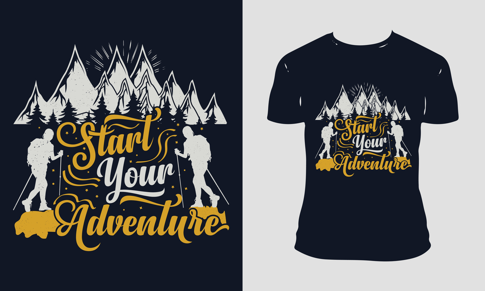
Contrast, even though a part of the colour choice, is equally important to consider. Contrast is the degree of visual difference between the lighter and the darker parts of a picture or how the colours correspond to one another. The strongest contrast is always white-on-black or the other way round and bright colours on dark backgrounds.
The design plays a significant in the overall contrast, regarding the content and what colours are the most dominant or get the most surface area. An attention-catching picture with saturated colours can really increase the contrast with a neutral background. But the highest contrast is not the goal all the time as some people prefer subtle low contrast prints however, it is a fine line between no contrast and low-contrast so be careful.
Some common contrast t shirt designing mistakes that people make are navy on black shirts, ice grey on white shirts, or light grey ink or sport grey shirts. These are all low contrast combos and not recommended.
Final Takeaway
These are all the T Shirt Designing Mistakes that you must avoid at all costs if you do not want to end up with a crappy design.
Also Read:
- Polo Shirt: What You Need To Know About It
- 5 Summer T Shirts Style Australia 2021/22
- Seasonal Design T-shirt Trends for 2021/22

